Siegel+Gale’s Brian Rafferty Explains Why the Best Logo Designs are the Simplest Ones
What makes a logo successful? Ask a dozen different designers, and you’ll get a dozen different answers. But how do you quantify a logo’s excellence, or lack thereof? If you’re Siegel+Gale, you organize a study of 3,000 respondents in the U.S. and U.K. to try to put some actual stats on the problem.
We spoke with Siegel+Gale’s global director of research insights, Brian Rafferty, to find out what makes logos memorable, and why logo backlash is often not as big a deal as it first appears.

Simple Logos are Best
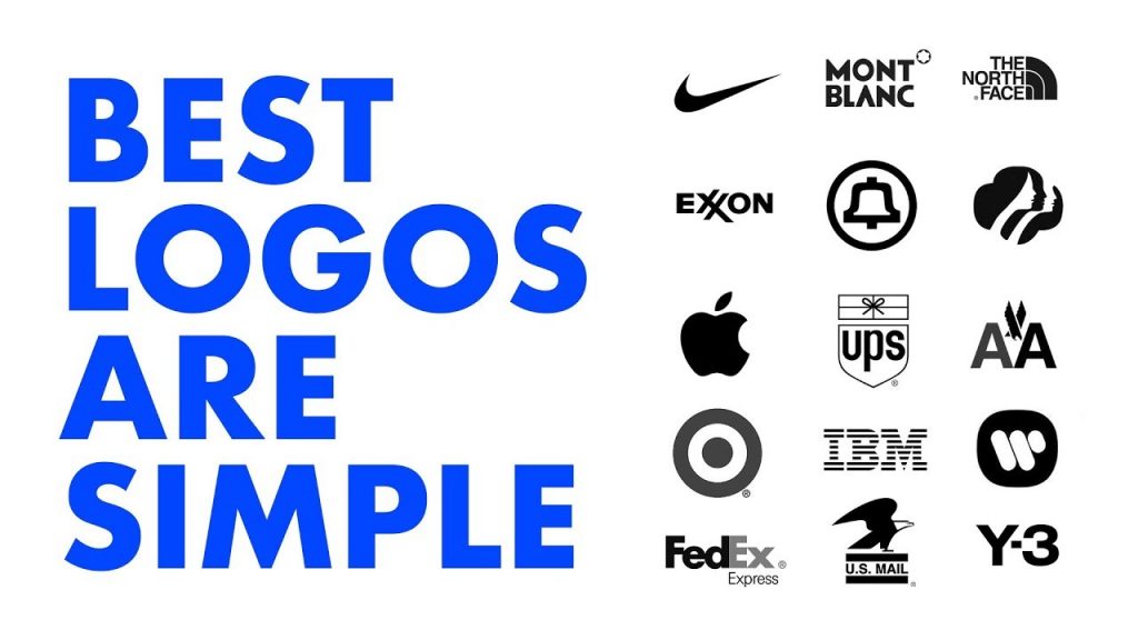
The best logos, says Rafferty, are the simplest ones. “Simplicity is what sticks in people’s minds now,” he says. Globally, participants in Siegel+Gale’s study said the most memorable logos belonged to Nike, Apple, McDonald’s, and Coca-Cola. All of these logos are fairly simple: either an unadorned geometric symbol, or a straightforward, font-based wordmark.
All of these are huge brands, but Rafferty says that even if participants didn’t recognize a brand, the simpler logos proved most memorable. Participants of the study were shown an assortment of about 100 logos, and asked if they recognized them. Then, at the end of the test, they were asked to identify the logos they had seen earlier from a pool of ones they hadn’t been shown. Across the board, the simplest logos always proved the most memorable.
Memorable Logos Make Consumers Curious
While a designer might be inclined to make a logo more complicated to try to communicate as much about a brand as possible, Siegel+Gale found that consumers were 13% more interested in simple, memorable logos than they were by more complicated ones.
They were also 7% more likely to make consumers curious about the brand, and 6% more likely to suggest a company was unique compared to its competitors.
Trustworthiness Isn’t Necessarily Communicated by a Logo
According to Siegel+Gale’s study, sans serif and font-based wordmarks were more likely to be deemed “trusted” and “reliable” by participants than other kinds of logos.
Despite this, though, Rafferty says that trustworthiness and reliability isn’t something that you can “design” into a logo: rather, it’s a larger issue of brand perception that is not transmitted by logo. If you want your brand to be perceived as trustworthy, a sans serif logo might be able to temporarily borrow some of the goodwill consumers have for other brands with sans serif logos, but that trust goes away if your brand doesn’t earn it for itself.
You Can Quantify New-Logo Backlash
One of the big takeaways from the study, Rafferty says, is that despite conventional wisdom, familiarity does not breed contempt when it comes to logos.
In fact, the more familiar a logo is, the more people associate it with positive traits like trustworthiness, respect, reliability, innovation, and friendliness. If a logo is unfamiliar, though, people tend to use negative words to describe it, like pretentious, tacky, or boring.
What does this mean? If you’re considering redesigning your logo, expect backlash. But Rafferty also says you can quantify this backlash. For example, if you’re worried that 10% of people who respond to your new logo call it “boring,” that’s actually pretty good: No matter what the logo, consumers are 14.69% more likely to call it boring if they don’t recognize it, according to Siegel+Gale’s findings.
“We hope this gives an argument to companies who launch a new brand and get some backlash,” Rafferty says. “Our research says that’s often just a reaction to the new.”
Conclusion
Although this is just a small assortment of Siegel+Gale’s findings, Rafferty hopes the study will serve as a useful series of benchmarks that allow them to better talk to clients about logo design.
“Every designer on staff would be lining up to shoot me if I said this study could be programmed into an algorithm for perfect logo design,” he says. “But we do hope that these findings will allow us to have more rational, fact-based conversations around logo design.”
You can read the full results of Siegel+Gale’s “Logos Now” study here.
NEED A SIMPLE (AND GREAT) LOGO?
SOMEBODY DOES THAT …

SHARE THIS ARTICLE ON YOUR FAVORITE SOCIAL NETWORK


